01
A Book That Embodies Nonverbal Expression
Expressing the Sense of Gravity and Weightlessness of Its Contents with a Uniquely Placed “Book Band”
Mr. Toshiki Koike has a wealth of experience producing various collections of art, and is a designer who highly values the entire process of putting together books in print which capture the essence of an author’s style from the very first step of outlining a design. At the same time, his designs under this standard often require special orders that can’t be accommodated by a typical publication process.
Having a strong interest in both Ikeuchi Akiko’s art collection and Mr. Koike’s books designs, this time, we were able to speak directly with the paper manufacturer, Shinohara Shiko.
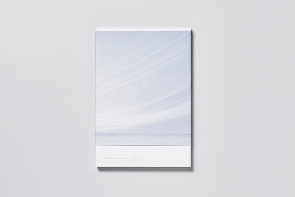
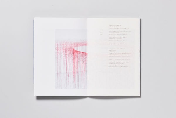
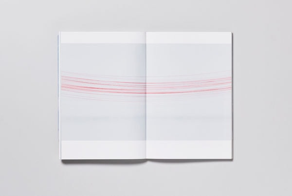
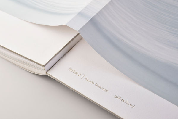
Ikeuchi Akiko’s collection features installations that produce a sense of space through the use of silk string. The silk strands stretched from wall to wall appear as though hovering in midair. Mr. Koike’s book design is inspired by the perspective of expressing the tension of the strands in the installation, a weightlessness that seems to resist gravity, as well as the experience of the person viewing the work.
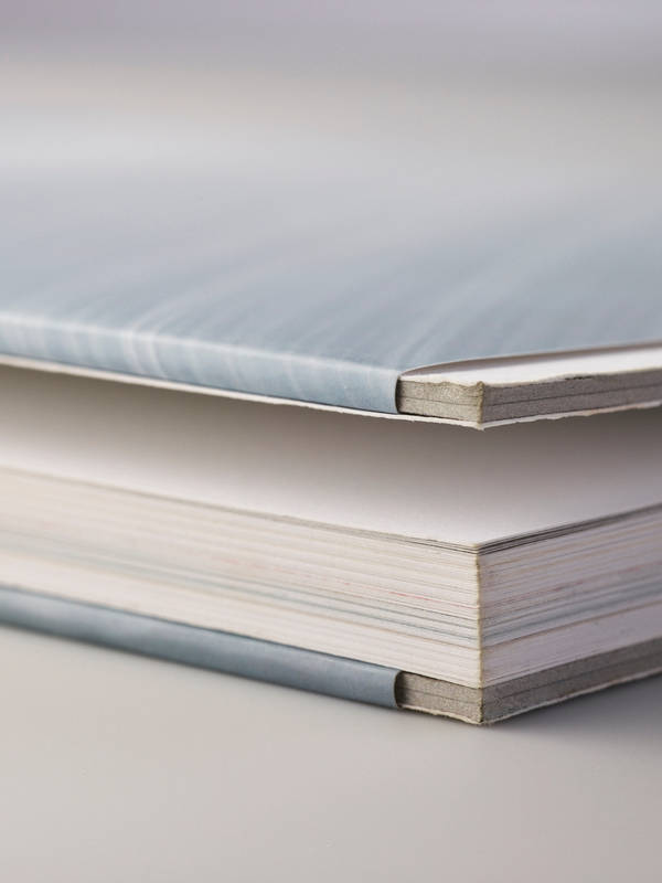
The book band is typically placed around the bottom section of a book. Mr. Koike’s attention was drawn to the band when he came up with the idea to use it as a means to express the gravity and weightless embodied by the works. He decided to fix the band in the midsection of the book as opposed to the top or the standard placement at the bottom. Now the question was a matter of whether this could be mass produced in a factory?
When Manufacturing Books, Understanding the Client’s Design Concept Comes Before Deciding Whether Something Can or Can’t Be Done
While there’s no doubt that the primary task of the printing company is to manufacture the book itself, our greatest priority at Shinohara Shiko is to collaborate on a concept with our customers. “Why does the book band need to be in such an unusual place?” “Why does it have to be white?” Mr. Koike’s thoughts and intentions with his concept made perfect sense to us as the manufacturer upon seeing the contents of Ms. Ikeuchi’s work. We came up a manufacturing proposal based on a premise of fixing the band around the middle section.
While most people would probably think to simply fix the band over the endpaper, doing so would have made it look sloppy as a whole. As the manufacturer, even if we were to be especially careful when affixing the bands to the books, using a basic method would cause the final product to deviate from the design concept.
One goal was to convey the weightlessness of Ms. Ikeuchi’s works by placing the book band around the midsection of the book. The other was to express that the position of the book band was something purposefully incorporated at the point of the book’s design. At Shinohara Shiko, our responsibility is to give shape to these kinds of fine considerations on behalf of the designer. In this case, we elected to wrap the book band in between the cover and the endpaper. At the same time, more time-consuming methods also result in higher costs, and we have to ensure that there isn’t a disparity in quality during mass production. This requires making extensive considerations beforehand as well as original improvisations to account for the various risks involved.
There are always issues that surface during the manufacturing process of any project, and you end up with some products along the way that you want to look at and say, “well, this much should be alright”. Nevertheless, these small concessions do get noticed by customers, and they can ultimately compromise the overall presentation of the book’s image.
In order to prevent this from happening, we were diligent about referring back to the designer’s concept, and while we had to make certain modifications during the manufacturing process at the factory, we were able to successfully deliver the product as requested. This book was ultimately awarded Minister of Education Award for Fine Arts at the 52nd Book Design Awards.
The most important aspect of book manufacturing is not to make a goal out of manufacturing the book itself, but rather for the designer and printing company to collaborate on ideas regarding what needs to be expressed through the book and what they want to create. This project gave us the opportunity to reaffirm this focus as the starting point for our concept of craftsmanship.
担当 : 篠原慶丞
デザイナーの小池さんとコンセプトを共有することで、本の世界観を確実に表現することができました。