

21
What is failure?
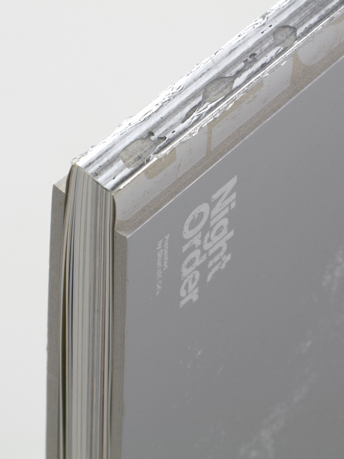
“Night Order,” a photo book depicting the state of a city where the people had disappeared due to the passage of the Coronavirus
The specifications of this photo book were decided during the meeting on the design and bookbinding specifications, and a book that was on the bookshelf of Shinohara Paper Works that had a spine that was about to peel off provided a hint.
The book with the spine that was about to peel off … was actually a product of a failed prototype. I was experimenting with foil film processing on the spine of a book bound with glue, which I thought would give it a metallic texture, but it didn’t fix well and then I gave up. However, I thought “perhaps one of the staff who sees the failed work won’t mind the uneven feel of the film?” and secretly stored it on the bookshelf.
When I was coming up with ideas about what was a good way to express, through bookmaking, the quietness we have never seen before when all signs of people disappeared from the bustling city and many restaurants were closed, and how what we had taken for granted up until now could so easily collapse, what caught my eye was this book which I had regarded as a failure during my experimentation.
A story where the phrase “there is no such word as failure” applies perfectly.
Shinohara often says: “When we experiment with something, what happens if we do this, or do this? I think if we perceive each of these like a small discovery and we continue to accumulate those, we will create unexpected new things and ways of thinking.”
Even if you can’t achieve the goal you envisioned, if you don’t write off the results as a “failure” and use them as the material that will lead to the next thing, the time may eventually come when it will be useful to you. This somehow wonderful way of thinking is one that I definitely want to incorporate not only into the world of making things, but also as a way of thinking for everyday life.


担当 : 篠原慶丞
本の内容を製本の装丁や加工で表現する事ができ、なおかつチャレンジングな技術をふんだんに使った書籍という物質的な特別感もそうですが、それ以上に、この装丁が決まるまでのチーム内の意見の交わし合い、出来上がった時の喜びの共感など、この本を作るために集まったチームとの連帯感も私にとっても思い出深い仕事です。