10
The one-yen book
Thinking about “bookbinding” from the perspective of “value”
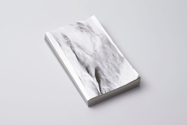
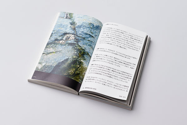
The magazine “Kokoku” (advertisement) is an interesting magazine that barely deals with advertisements despite its name. The overall theme is “What is making something good?” and in this issue, the magazine covers “value.”
Kotaro Nishitani from Heiwa Paper always introduces interesting projects and many kinds of people. The client requested making the magazine “Kokoku” utilizing paper, printing, and bookbinding technology thoroughly. This time, Nishitani asked Shinohara for support again. The discussion started with what kind of bookbinding to do with the concept of “value.” In the meeting, designers shared their ideas, and Shinohara presented answers on whether the ideas were feasible from a technical perspective. We also considered ourselves what kind of styles were best to express “value” through bookbinding.
All designers had the common notion that they wanted to express the presence as an “object.” To do so, there needed to be many pages. However, creating a luxurious feel through making it hardcover and seeing the value in that was not the intention, so the binding was made as simple as possible. There were requests to express the bundle of paper and its thickness, so from that, there was an idea to do a top-gluing binding. When we explained that top-gluing binding was easy to break apart, designers commented, “it’s ok to break.” However, there is a big difference between whether it is ok to break and whether it should break (as some concept find significance in something breaking). The client was asked the intention and said, “it’s ok if it breaks, but it’s better that it doesn’t.” From this comment, we proposed skeleton binding.
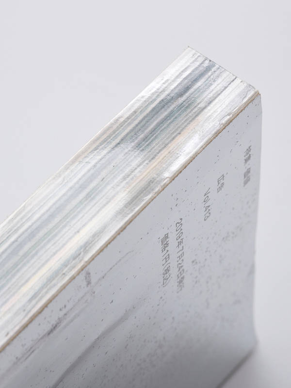
In skeleton binding, the book spine is bound using transparent glue called PUR, and the spine is bare without any cover. As it is transparent glue and the spine reveals the layers of paper, Shinohara Shiko named it “skeleton binding.”
Tokyo and Kyoto – team collaboration with a support company
Skeleton binding was the final specification that was decided. As the selection of the creation team was the responsibility of Shinohara, we requested Atsushi Shinozawa from SunM Color to do the printing, which is a famous company for artistic printing. We could also think of “someone we wanted to work with someday” really profoundly. That was Fujiwara Book Binding Works in Kyoto. Shinohara and the company were together in the overseas tour hosted by a machine manufacturer. At the time, there were many common notions between the two, so we respected the company. Both Fujiwara Bookbinding Works and SunM Color were based in Kyoto, so the efficiency was good in terms of shipping. We felt that Fujiwara was a perfect choice, and we were happy that we could work together, which was our wish.
Bookbinding Honma in Saitama also supported us in the PUR bookbinding process. In this project, it was difficult to make all the number of copies using equipment at Shinohara Shiko, so a supporting company was essential. Shinohara handled the bookbinding and pushed the project forward, closely communicating with the supporting company. We asked Fujiwara Bookbinding Works to do the “bending” while we asked Bookbinding Honma to do the “PUR bookbinding.” We went back and forth between Kyoto and Tokyo until the single book was completed. For this, we visited the creation site of each company every time and explained how the final product should be using samples. However, as they had never seen skeleton binding before, they asked, “Shinohara, does this look right?”
To create the best book form, Shinohara Shiko tries unconventional initiatives that are not usually found in the bookbinding industry, while understanding that significance. We use that in special projects, so when companies ask us, “oh, is this really fine?” it honestly tingles our sense of creativity. We answer with confidence saying, “yes, this is the way it should be.”
Often, when processes are divided up in the creation sites, workers often lose sight of how the book will be in the final form. As such, when we sent the finally finished magazine “Kokoku” to all the supporting companies, people in the creation sites were happy and commented, “I never knew it would be such an interesting book in the end. I’m glad I could be involved in this project.” This feedback made us very pleased.
What is value?
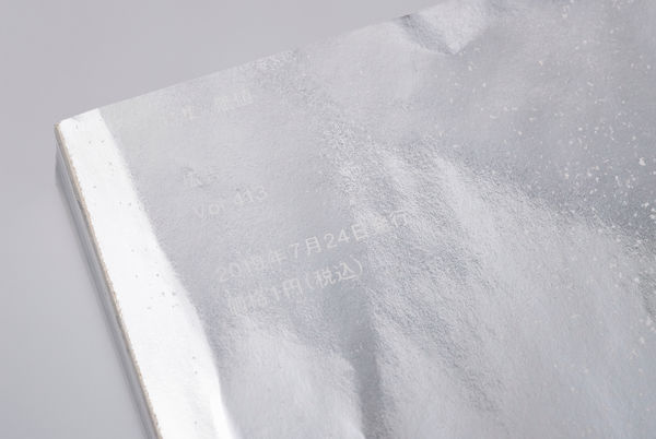
There was another interesting and thought-provoking thing about “Kokoku.” The price was one yen. The fact that there was a price of one yen meant that it was distributed. At Shinohara, we thought “our job is making things so making “something good” was value, but we started to think more deeply about what “value” was.” That’s the kind of thing we talked about.
Although it is important to make good things, maybe Shinohara Shiko also values the human drama played out in a variety of scenes when making something.
How do you think about the value of a one-yen book?


担当 : 篠原慶丞
自社の制作現場が動かないからこそプロジェクトの趣旨を自分の中で明確にし、加工において重要なポイントを翻訳すること。そして協力会社の担当の方だけでなく作業を担当するオペレーターの方々にも伝わるようにコミュニケーションの仕方や頻度に気を使いながら進める事ができ、自分が大切にしたい仕事の進め方というのが今まで以上に腑に落ちた案件となりました。